Here are a few tips for making heatmaps with the pheatmap R package by Raivo Kolde. We’ll use quantile color breaks, so each color represents an equal proportion of the data. We’ll also cluster the data with neatly sorted dendrograms, so it’s easy to see which samples are closely or distantly related.
The code for this post is available here:
Making random data #
Let’s make some random data:
set.seed(42)
random_string <- function(n) {
  substr(paste(sample(letters), collapse = ""), 1, n)
}

mat <- matrix(rgamma(1000, shape = 1) * 5, ncol = 50)

colnames(mat) <- paste(
  rep(1:3, each = ncol(mat) / 3),
  replicate(ncol(mat), random_string(5)),
  sep = ""
)
rownames(mat) <- replicate(nrow(mat), random_string(3))
Here’s the data:
mat[1:5,1:5]
#>        1jrqxa     1pskvw   1ojvwz    1uomgt     1kyzed
#> abv 9.6964789  9.1728114 2.827695 0.3945351  8.0549350
#> nft 0.9020955 15.5758530 4.328376 2.0908362 34.3081971
#> xha 2.6721643  3.1270386 1.765077 0.3404244  2.3428120
#> trb 0.1198261  0.3569485 4.980206 1.7912319  2.4935602
#> oar 2.1388712  4.6040106 9.897896 0.1263967  0.3518315
Let’s split our columns into 3 groups:
col_groups <- substr(colnames(mat), 1, 1)
table(col_groups)
#> col_groups
#>  1  2  3
#> 18 16 16
Let’s increase the values for group 1 by a factor of 5:
mat[,col_groups == "1"] <- mat[,col_groups == "1"] * 5
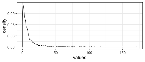
The data is skewed, so most of the values are below 50, but the maximum value is 172 :
# install.packages("ggplot2")
library(ggplot2)
# Set the theme for all the following plots.
theme_set(theme_bw(base_size = 16))

dat <- data.frame(values = as.numeric(mat))
ggplot(dat, aes(values)) + geom_density(bw = "SJ")
Making a heatmap #
Let’s make a heatmap and check if we can see that the group 1 values are 5 times larger than the group 2 and 3 values:
# install.packages("pheatmap", "RColorBrewer", "viridis")
library(pheatmap)
library(RColorBrewer)
library(viridis)

# Data frame with column annotations.
mat_col <- data.frame(group = col_groups)
rownames(mat_col) <- colnames(mat)

# List with colors for each annotation.
mat_colors <- list(group = brewer.pal(3, "Set1"))
names(mat_colors$group) <- unique(col_groups)

pheatmap(
  mat               = mat,
  color             = inferno(10),
  border_color      = NA,
  show_colnames     = FALSE,
  show_rownames     = FALSE,
  annotation_col    = mat_col,
  annotation_colors = mat_colors,
  drop_levels       = TRUE,
  fontsize          = 14,
  main              = "Default Heatmap"
)

The default color breaks in pheatmap are uniformly distributed across
the range of the data.
We can see that values in group 1 are larger than values in groups 2 and 3. However, we can’t distinguish different values within groups 2 and 3.
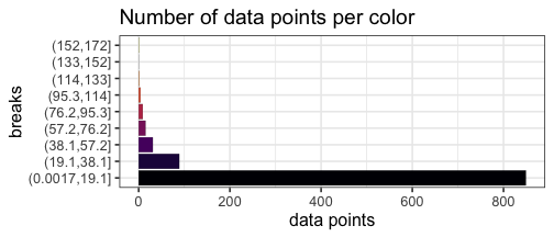
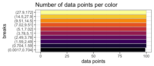
Uniform breaks #
We can visualize the unequal proportions of data represented by each color:
mat_breaks <- seq(min(mat), max(mat), length.out = 10)
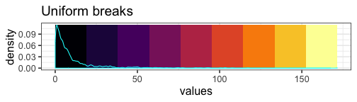
With our uniform breaks and non-uniformly distributed data, we represent 86.5% of the data with a single color.
On the other hand, 6 data points greater than or equal to 100 are represented with 4 different colors.
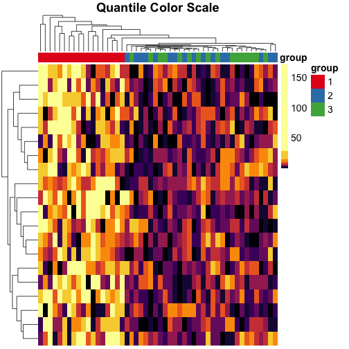
Quantile breaks #
If we reposition the breaks at the quantiles of the data, then each color will represent an equal proportion of the data:
quantile_breaks <- function(xs, n = 10) {
  breaks <- quantile(xs, probs = seq(0, 1, length.out = n))
  breaks[!duplicated(breaks)]
}

mat_breaks <- quantile_breaks(mat, n = 11)
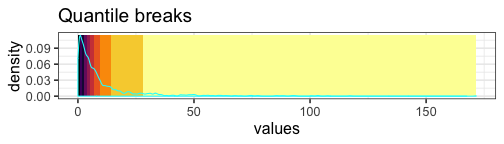
When we use quantile breaks in the heatmap, we can clearly see that group 1 values are much larger than values in groups 2 and 3, and we can also distinguish different values within groups 2 and 3:
pheatmap(
  mat               = mat,
  color             = inferno(length(mat_breaks) - 1),
  breaks            = mat_breaks,
  border_color      = NA,
  show_colnames     = FALSE,
  show_rownames     = FALSE,
  annotation_col    = mat_col,
  annotation_colors = mat_colors,
  drop_levels       = TRUE,
  fontsize          = 14,
  main              = "Quantile Color Scale"
)
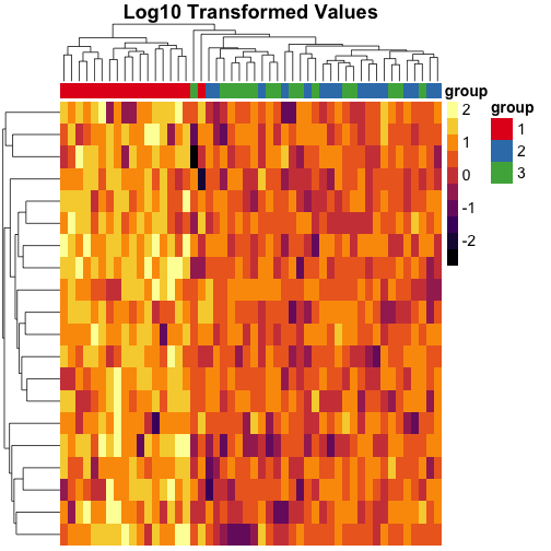
Transforming the data #
We can also transform the data to the log scale instead of using quantile breaks, and notice that the clustering is different on this scale:
pheatmap(
  mat               = log10(mat),
  color             = inferno(10),
  border_color      = NA,
  show_colnames     = FALSE,
  show_rownames     = FALSE,
  annotation_col    = mat_col,
  annotation_colors = mat_colors,
  drop_levels       = TRUE,
  fontsize          = 14,
  main              = "Log10 Transformed Values"
)
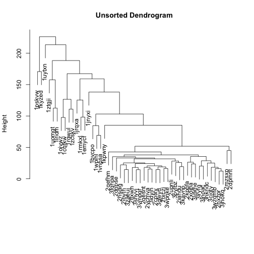
Sorting the dendrograms #
The dendrogram on top of the heatmap is messy, because the branches are ordered randomly:
mat_cluster_cols <- hclust(dist(t(mat)))
plot(mat_cluster_cols, main = "Unsorted Dendrogram", xlab = "", sub = "")
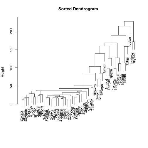
Let’s flip the branches to sort the dendrogram. The most similar columns will appear clustered toward the left side of the plot. The columns that are more distant from each other will appear clustered toward the right side of the plot.
# install.packages("dendsort")
library(dendsort)

sort_hclust <- function(...) as.hclust(dendsort(as.dendrogram(...)))

mat_cluster_cols <- sort_hclust(mat_cluster_cols)
plot(mat_cluster_cols, main = "Sorted Dendrogram", xlab = "", sub = "")
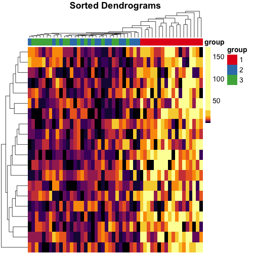
Let’s do the same for rows, too, and use these dendrograms in the heatmap:
mat_cluster_rows <- sort_hclust(hclust(dist(mat)))
pheatmap(
  mat               = mat,
  color             = inferno(length(mat_breaks) - 1),
  breaks            = mat_breaks,
  border_color      = NA,
  cluster_cols      = mat_cluster_cols,
  cluster_rows      = mat_cluster_rows,
  show_colnames     = FALSE,
  show_rownames     = FALSE,
  annotation_col    = mat_col,
  annotation_colors = mat_colors,
  drop_levels       = TRUE,
  fontsize          = 14,
  main              = "Sorted Dendrograms"
)
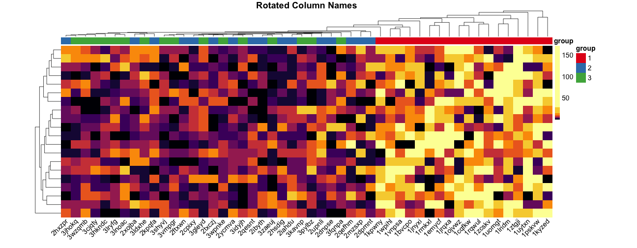
Rotating column labels #
Here’s a way to rotate the column labels in pheatmap (thanks to Josh O’Brien):
# Overwrite default draw_colnames in the pheatmap package.
# Thanks to Josh O'Brien at http://stackoverflow.com/questions/15505607
draw_colnames_45 <- function (coln, gaps, ...) {
    coord <- pheatmap:::find_coordinates(length(coln), gaps)
    x     <- coord$coord - 0.5 * coord$size
    res   <- grid::textGrob(
      coln, x = x, y = unit(1, "npc") - unit(3,"bigpts"),
      vjust = 0.75, hjust = 1, rot = 45, gp = grid::gpar(...)
    )
    return(res)
}
assignInNamespace(
  x = "draw_colnames",
  value = "draw_colnames_45",
  ns = asNamespace("pheatmap")
)

pheatmap(
  mat               = mat,
  color             = inferno(length(mat_breaks) - 1),
  breaks            = mat_breaks,
  border_color      = NA,
  cluster_cols      = mat_cluster_cols,
  cluster_rows      = mat_cluster_rows,
  cellwidth         = 20,
  show_colnames     = TRUE,
  show_rownames     = FALSE,
  annotation_col    = mat_col,
  annotation_colors = mat_colors,
  drop_levels       = TRUE,
  fontsize          = 14,
  main              = "Rotated Column Names"
)