Harmony is a an algorithm for aligning multiple high-dimensional datasets, described by Ilya Korsunsky et al. in this paper. When analyzing multiple single-cell RNA-seq datasets, we often encounter the problem that each dataset is separated from the others in low dimensional space – even when we know that all of the datasets have similar cell types. To address this problem, the Harmony algorithm iteratively clusters and adjusts high dimensional datasets to integrate them on a single manifold. In this note, we will create animated visualizations to see how the algorithm works and develop an intuitive understanding.
Harmony in motion #
Let’s make this animation:
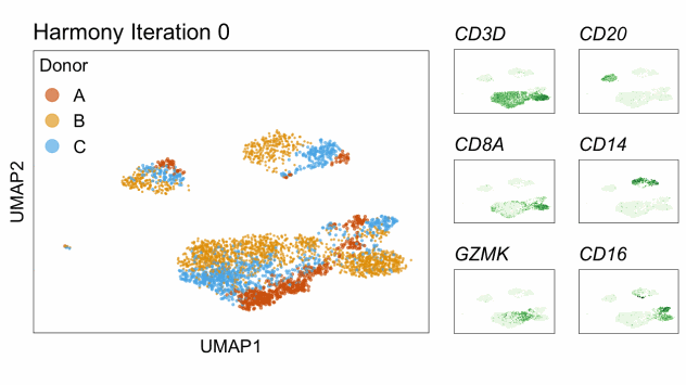
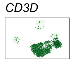
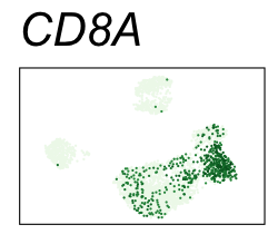
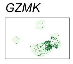
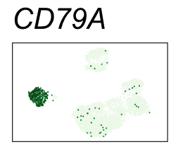
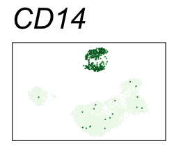
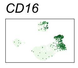
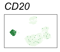
Single-cell RNA-seq data reduced to two dimensions with PCA and UMAP. 3,500 peripheral blood mononuclear cells (PBMCs). Each cell is from one of the donors (A, B, and C). Six markers are shown for different cell types. Color indicates gene expression as log2(CPM+1) (CPM is counts per million). The animation starts with unadjusted PCs, and then cycles through 3 iterations of the Harmony algorithm applied to the PCs.
| Gene | Cell type |
|---|---|
| CD3D | T cells |
| CD8A | CD8 T cells |
| GZMK | NKT cells |
| CD20 | B cells |
| CD14 | Monocytes |
| CD16 | Natural killer cells, neutrophils, monocytes, and macrophages |
Install packages #
These are the critical R packages I used to write this note:
- MUDAN by Jean Fan
- Harmony and presto by Ilya Korsunsky
- gganimate by Thomas Lin Pedersen
devtools::install_github("jefworks/MUDAN")

devtools::install_github("immunogenomics/harmony")
devtools::install_github("immunogenomics/presto")

install.packages("gganimate")
Run Principal Component Analysis #
The MUDAN package comes pre-loaded with some single-cell RNA-seq data published by 10x Genomics. Let’s load it into our R session.
data("pbmcA")
dim(pbmcA)
#> [1] 13939  2896
data("pbmcB")
dim(pbmcB)
#> [1] 15325  7765
data("pbmcC")
dim(pbmcC)
#> [1] 16144  9493
Some of the cells with very high read counts or very low read counts can be difficult to cluster together with the other cells. For this reason, we exclude some of the outlier cells from each dataset.
exclude_outliers <- function(mat, low = 0.06, high = 0.94) {
  mat_sum <- colSums(mat)
  qs <- quantile(mat_sum, c(low, high))
  ix <- mat_sum > qs[1] & mat_sum < qs[2]
  return(mat[, ix])
}

pbmcA <- exclude_outliers(pbmcA)
pbmcB <- exclude_outliers(pbmcB)
pbmcC <- exclude_outliers(pbmcC)

# Genes and cells in each counts matrix.
dim(pbmcA)
#> [1] 13939  2548
dim(pbmcB)
#> [1] 15325  6831
dim(pbmcC)
#> [1] 16144  8351

pbmcA <- pbmcA[, 1:500] # take 500 cells
pbmcB <- pbmcB[, 1:2000] # take 2000 cells
pbmcC <- pbmcC[, 1:1000] # take 1000 cells

# Concatenate into one counts matrix.
genes.int <- intersect(rownames(pbmcA), rownames(pbmcB))
genes.int <- intersect(genes.int, rownames(pbmcC))
counts <- cbind(pbmcA[genes.int,], pbmcB[genes.int,], pbmcC[genes.int,])
rm(pbmcA, pbmcB, pbmcC)

# A dataframe that indicates which donor each cell belongs to.
meta <- str_split_fixed(colnames(counts), "_", 2)
meta <- as.data.frame(meta)
colnames(meta) <- c("donor", "cell")
head(meta)
#>   donor           cell
#> 1     A AAACATTGCACTAG
#> 2     A AAACATTGGCTAAC
#> 3     A AAACATTGTAACCG
#> 4     A AAACCGTGTGGTCA
#> 5     A AAACCGTGTTACCT
#> 6     A AAACGCACACGGGA

# Number of cells from each donor.
table(meta$donor)
#>
#>    A    B    C
#>  500 2000 1000

# How many genes (rows) and cells (columns)?
dim(counts)
#> [1] 13414  3500

# How many entries in the counts matrix are non-zero?
sparsity <- 100 * (1 - (length(counts@x) / Reduce("*", counts@Dim)))
The matrix of read counts is 94.9% sparse. That means that the vast majority of values in the matrix are zero.
Now, we can use functions provided by the MUDAN R package to:
- normalize the counts matrix for number of reads per cell
- normalize the variance for each gene
- run principal component analysis (PCA)
# CPM normalization
counts_to_cpm <- function(A) {
A@x <- A@x / rep.int(Matrix::colSums(A), diff(A@p))
A@x <- 1e6 * A@x
return(A)
}
cpm <- counts_to_cpm(counts)
log10cpm <- cpm
log10cpm@x <- log10(1 + log10cpm@x)
# variance normalize, identify overdispersed genes
cpm_info <- MUDAN::normalizeVariance(cpm, details = TRUE, verbose = FALSE)
# 30 PCs on overdispersed genes
set.seed(42)
pcs <- getPcs(
mat = log10cpm[cpm_info$ods,],
nGenes = length(cpm_info$ods),
nPcs = 30,
verbose = FALSE
)
pcs[1:5, 1:5]
#> PC1 PC2 PC3 PC4 PC5
#> A_AAACATTGCACTAG 1.767734 -14.418014 0.5740947 8.818121 2.7819395
#> A_AAACATTGGCTAAC 1.052417 6.005906 -10.2430982 4.035912 -1.5828038
#> A_AAACATTGTAACCG -2.031748 2.600434 1.5062893 5.392586 0.2284509
#> A_AAACCGTGTGGTCA -1.069945 -3.784165 -0.5634285 3.477583 4.9772192
#> A_AAACCGTGTTACCT 1.496703 5.978402 -11.1087743 3.943560 -1.5968947
dat_pca <- as.data.frame(
str_split_fixed(rownames(pcs), "_", 2)
)
colnames(dat_pca) <- c("donor", "cell")
dat_pca <- cbind.data.frame(dat_pca, pcs)
p <- ggplot(dat_pca[sample(nrow(dat_pca)),]) +
scale_size_manual(values = c(0.9, 0.3, 0.5)) +
scale_color_manual(values = donor_colors) +
theme(legend.position = "none")
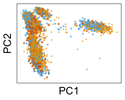
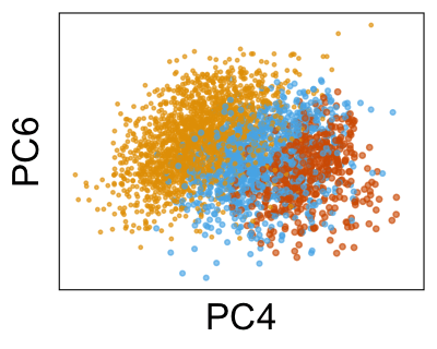
p1 <- p + geom_point(aes(PC1, PC2, color = donor, size = donor))
p2 <- p + geom_point(aes(PC3, PC4, color = donor, size = donor))
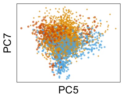
p3 <- p + geom_point(aes(PC5, PC6, color = donor, size = donor))
p4 <- p + geom_point(aes(PC7, PC8, color = donor, size = donor))
this_title <- sprintf(
"PCA with %s genes and %s cells from 3 PBMC samples, published by 10x Genomics",
scales::comma(nrow(log10cpm[cpm_info$ods,])),
scales::comma(nrow(dat_pca))
)
p1 + p2 + p3 + p4 + plot_layout(ncol = 4) + plot_annotation(title = this_title)
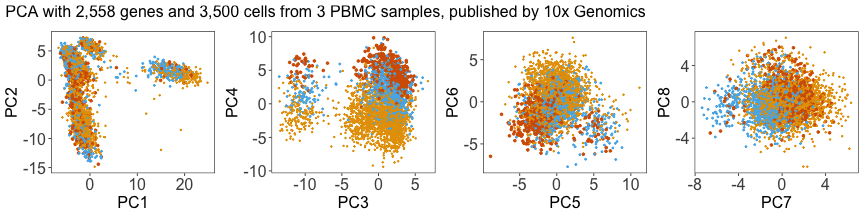
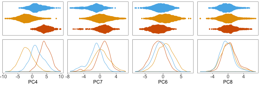
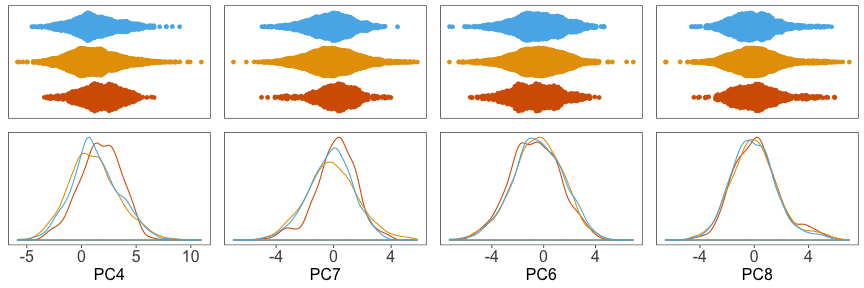
Next, we can plot the density of cells along each PC, grouped by donor. Below, we can see that the distributions for each donor are shifted away from each other, especially along PC4.
Use Harmony to adjust the PCs #
We can run Harmony to adjust the principal component (PC) coordinates from the two datasets. When we look at the adjusted PCs, we can see that the donors no longer clearly separate along any of the principal components.
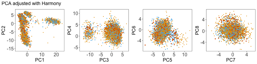
And the densitites:
Now we can proceed with our analysis using the adjusted principal component coordinates.
Group the cells into clusters #
To group cells into clusters, we can use the MUDAN R package again. First, we build a nearest neighbor network and then we can identify clusters (or communities) in the network of cells with the Louvain community detection algorithm or the Infomap algorithm.
# Joint clustering
set.seed(42)
com <- MUDAN::getComMembership(
  mat = harmonized,
  k = 30,
  # method = igraph::cluster_louvain
  method = igraph::cluster_infomap
)
#> [1] "finding approximate nearest neighbors ..."
#> [1] "calculating clustering ..."
#> [1] "graph modularity: 0.683895626832917"
#> [1] "identifying cluster membership ..."
#> com
#>    1    2    3    4    5    6    7    8    9
#> 1086  613  563  421  328  183  141  126   39
dat_harmonized$cluster <- com
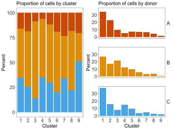
Compute differential gene expression for each cluster #
To find genes that are highly expressed in each cluster, we can use the presto R package by Ilya Korsunsky. It will efficiently compute differential expression statistics:
gene_stats <- presto::wilcoxauc(log10cpm, com)

# Sort genes by the difference between:
# - percent of cells expressing the gene in the cluster
# - percent of cells expressing the gene outside the cluster
gene_stats %>%
  group_by(group) %>%
  top_n(n = 2, wt = pct_in - pct_out) %>%
  mutate_if(is.numeric, signif, 3) %>%
  kable() %>%
  kable_styling(bootstrap_options = "striped", full_width = FALSE)
#> `mutate_if()` ignored the following grouping variables:
#> Column `group`
| feature | group | avgExpr | logFC | statistic | auc | pval | padj | pct_in | pct_out |
|---|---|---|---|---|---|---|---|---|---|
| LTB | 1 | 3.06 | 1.30 | 1810000 | 0.689 | 0 | 0 | 92.9 | 53.40 |
| LDHB | 1 | 2.88 | 1.26 | 2020000 | 0.771 | 0 | 0 | 91.7 | 54.30 |
| IL7R | 2 | 1.72 | 1.17 | 1250000 | 0.706 | 0 | 0 | 59.2 | 19.40 |
| LTB | 2 | 3.37 | 1.45 | 1410000 | 0.797 | 0 | 0 | 97.4 | 58.90 |
| FGFBP2 | 3 | 3.00 | 2.79 | 1530000 | 0.926 | 0 | 0 | 90.6 | 6.67 |
| GZMH | 3 | 3.18 | 2.96 | 1570000 | 0.947 | 0 | 0 | 93.4 | 7.35 |
| FCN1 | 4 | 3.35 | 3.29 | 1290000 | 0.992 | 0 | 0 | 98.6 | 2.34 |
| CST3 | 4 | 3.51 | 3.41 | 1290000 | 0.992 | 0 | 0 | 98.8 | 3.51 |
| CD79B | 5 | 2.70 | 2.55 | 952000 | 0.915 | 0 | 0 | 84.8 | 5.45 |
| CD79A | 5 | 2.95 | 2.92 | 987000 | 0.948 | 0 | 0 | 89.9 | 1.23 |
| GZMK | 6 | 2.88 | 2.62 | 555000 | 0.915 | 0 | 0 | 90.2 | 8.23 |
| NKG7 | 6 | 3.02 | 1.88 | 435000 | 0.716 | 0 | 0 | 90.2 | 30.90 |
| GNLY | 7 | 3.98 | 3.48 | 456000 | 0.963 | 0 | 0 | 98.6 | 14.30 |
| GZMB | 7 | 3.11 | 2.79 | 439000 | 0.927 | 0 | 0 | 91.5 | 9.94 |
| CCL5 | 8 | 3.68 | 2.48 | 368000 | 0.865 | 0 | 0 | 98.4 | 33.90 |
| NKG7 | 8 | 3.40 | 2.24 | 334000 | 0.785 | 0 | 0 | 96.0 | 31.70 |
| GNLY | 9 | 3.99 | 3.39 | 128000 | 0.952 | 0 | 0 | 97.4 | 16.80 |
| TYROBP | 9 | 2.90 | 2.18 | 109000 | 0.810 | 0 | 0 | 89.7 | 21.10 |
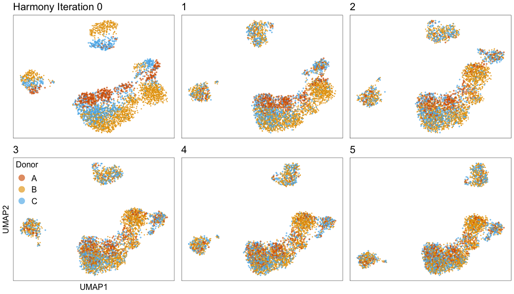
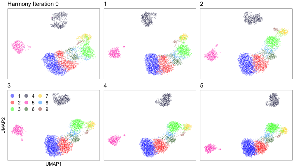
Save each iteration of Harmony #
Let’s run Harmony and limit the maximum number of iterations to 0, 1, 2, 3, 4, and 5. That way, we can track how the PC coordinates change after each iteration.
harmony_iters <- c(0, 1, 2, 3, 4, 5)
res <- lapply(harmony_iters, function(i) {
  set.seed(42)
  HarmonyMatrix(
    theta            = 0.15,
    data_mat         = pcs,
    meta_data        = meta$donor,
    do_pca           = FALSE,
    verbose          = FALSE,
    max.iter.harmony = i
  )
})
h <- do.call(rbind, lapply(harmony_iters, function(i) {
  x       <- as.data.frame(res[[i + 1]])
  x$iter  <- i
  y       <- str_split_fixed(rownames(x), "_", 2)
  x$donor <- y[,1]
  x$cell  <- y[,2]
  x
}))
h[1:6, c("iter", "donor", "PC1", "PC2", "PC3")]
#>                  iter donor       PC1        PC2         PC3
#> A_AAACATTGCACTAG    0     A  1.767734 -14.418014   0.5740947
#> A_AAACATTGGCTAAC    0     A  1.052417   6.005906 -10.2430982
#> A_AAACATTGTAACCG    0     A -2.031748   2.600434   1.5062893
#> A_AAACCGTGTGGTCA    0     A -1.069945  -3.784165  -0.5634285
#> A_AAACCGTGTTACCT    0     A  1.496703   5.978402 -11.1087743
#> A_AAACGCACACGGGA    0     A -2.889615   3.397147   2.3764580
For each run of Harmony, we will reduce 30 adjusted PCs to 2 dimensions with the UMAP algorithm implemented in the umap R package by Tomasz Konopka.
Since UMAP is a stochastic algorithm, the final layout of the cells on the
canvas can be significantly different from one run to the next. We want to
avoid these large stochastic changes, because our goal is to create a fluid
animation with cells slowly drifting toward their final positions. To do this,
we can pass the coordinates from the n-th iteration as the initial positions
for UMAP in the n+1-th iteration.
# Settings for UMAP.
umap.settings <- umap.defaults
umap.settings$min_dist <- 0.8

# List of results.
res.umap <- list()

umap.seed <- 43
set.seed(umap.seed)

# Run UMAP on the first iteration of Harmony's adusted PCs.
res.umap[[1]] <- umap(d = res[[1]], config = umap.settings)

for (i in 2:length(res)) {
  print(i)
  # Initialize UMAP with the coordinates from the previous Harmony iteration.
  umap.settings$init <- res.umap[[i - 1]]$layout
  set.seed(umap.seed)
  res.umap[[i]] <- umap(d = res[[i]], config = umap.settings)
}
#> [1] 2
#> [1] 3
#> [1] 4
#> [1] 5
#> [1] 6

d <- do.call(rbind, lapply(seq_along(res.umap), function(i) {
  d       <- as.data.frame(res.umap[[i]]$layout)
  colnames(d) <- c("UMAP1", "UMAP2")
  d       <- cbind.data.frame(d, res[[i]])
  d$id    <- colnames(counts)
  y       <- str_split_fixed(d$id, "_", 2)
  d$donor <- y[,1]
  d$cell  <- y[,2]
  d$iter  <- i - 1
  return(d)
})) %>% group_by(iter) %>% arrange(cell)

# Add a column with the cluster membership for each cell.
d$cluster <- com[as.character(d$id)]
head(d)
#> # A tibble: 6 x 37
#> # Groups:   iter [6]
#>    UMAP1 UMAP2   PC1   PC2   PC3    PC4   PC5    PC6   PC7   PC8   PC9
#>    <dbl> <dbl> <dbl> <dbl> <dbl>  <dbl> <dbl>  <dbl> <dbl> <dbl> <dbl>
#> 1 -0.517 11.9   20.1  1.44  2.82 -0.246 1.14   1.45   1.16  2.02 0.452
#> 2 -4.44  11.7   19.3  1.81  2.84  1.75  0.175 -0.448 -2.69  1.03 1.24
#> 3 -0.395  9.48  19.2  1.84  2.90  1.80  0.160 -0.418 -2.80  1.07 1.29
#> 4  0.562  9.45  19.2  1.84  2.90  1.80  0.160 -0.418 -2.80  1.07 1.29
#> 5  3.30  11.8   19.2  1.84  2.90  1.80  0.160 -0.418 -2.80  1.07 1.29
#> 6  6.15  13.4   19.2  1.84  2.90  1.80  0.160 -0.418 -2.80  1.07 1.29
#> # … with 26 more variables: PC10 <dbl>, PC11 <dbl>, PC12 <dbl>,
#> #   PC13 <dbl>, PC14 <dbl>, PC15 <dbl>, PC16 <dbl>, PC17 <dbl>,
#> #   PC18 <dbl>, PC19 <dbl>, PC20 <dbl>, PC21 <dbl>, PC22 <dbl>,
#> #   PC23 <dbl>, PC24 <dbl>, PC25 <dbl>, PC26 <dbl>, PC27 <dbl>,
#> #   PC28 <dbl>, PC29 <dbl>, PC30 <dbl>, id <chr>, donor <chr>, cell <chr>,
#> #   iter <dbl>, cluster <fct>

# Set a random order for the cells to avoid overplotting issues.
set.seed(42)
random <- sample(table(d$iter)[1])
d <- d %>% group_by(iter) %>% mutate(random = random) %>% arrange(iter, random)
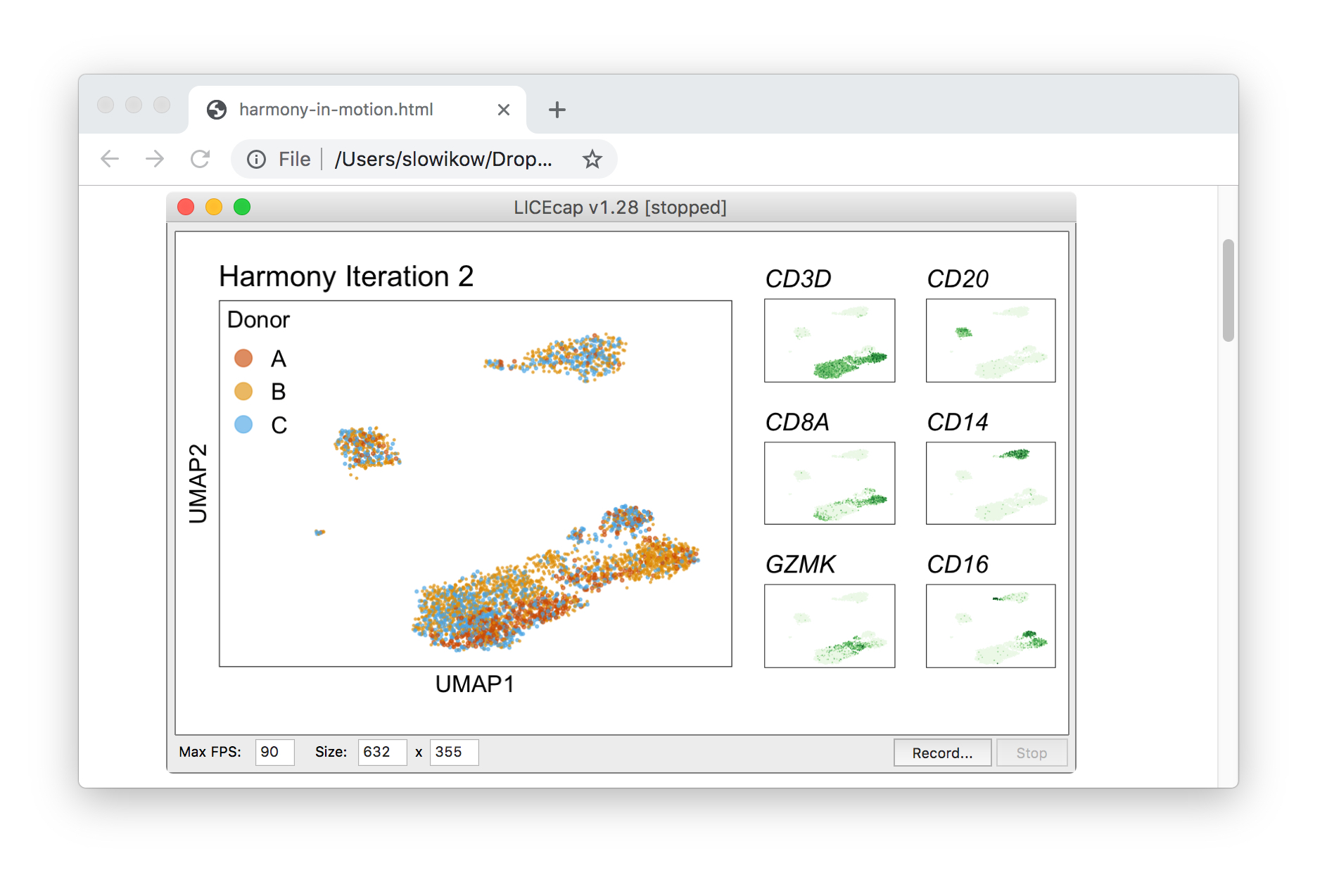
Harmony iterations colored by donor:
Harmony iterations colored by cluster:
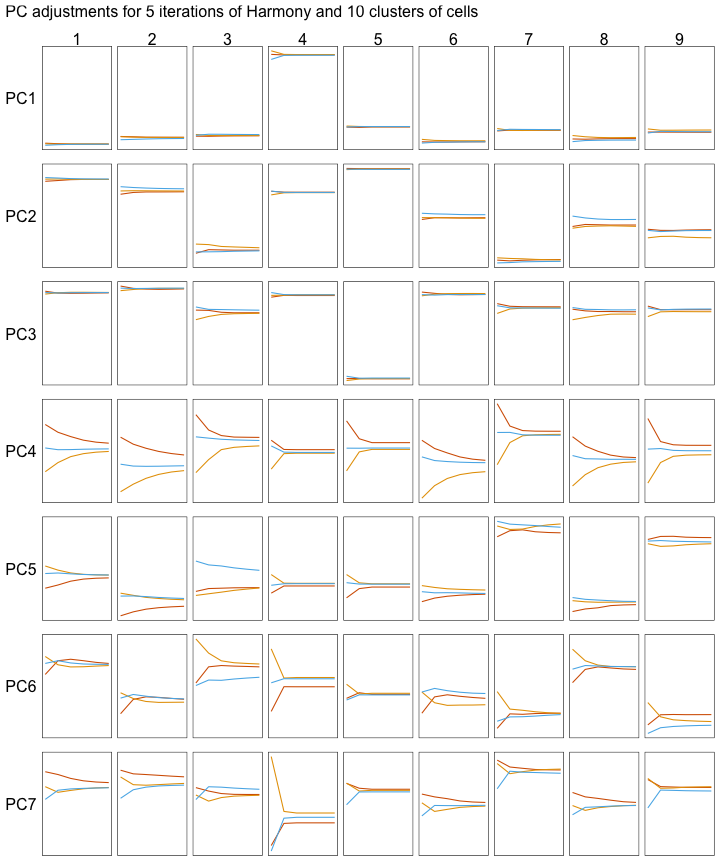
Below, we can see how the mean PC values change with each iteration of the Harmony algorithm. Each line represents the mean of cells that belong to one donor and one cluster of cells.
All cells are not adjusted by the same amount. Instead, each cell gets slightly different adjustments. Let’s look at one example by focusing on clusters 3 and 4 (the columns in the grid below).
Clusters 3 and 4 are each adjusted by different amounts:
- PC4 is adjusted more for cluster 3 than cluster 4.
- PC7 is adjusted more for cluster 4 than cluster 3.
Use gganimate to transition between each iteration #
To create an animation, we can use the gganimate package by Thomas Lin Pedersen to create smooth transitions between each iteration of Harmony:
animate_donor <- function(
  filename, x, y,
  nframes = 15, width = 250, height = 250 / 1.41, res = 150,
  iters = 0:5, hide_legend = FALSE
) {
  this_title <- "Harmony Iteration {closest_state}"
  # p <- plot_donor(subset(d, iter %in% iters), {{x}}, {{y}})
  x <- parse_expr(x)
  y <- parse_expr(y)
  p <- plot_donor(subset(d, iter %in% iters), !!x, !!y)
  if (hide_legend) {
    p <- p + theme(legend.position = "none")
  } else {
    p <- p + ggtitle(this_title)
  }
  p <- p + transition_states(iter, transition_length = 4, state_length = 1) +
    ease_aes("cubic-in-out")
  animation <- animate(
    plot = p,
    nframes = nframes, width = width, height = height, res = res
  )
  dir.create("animation", showWarnings = FALSE)
  print(filename)
  anim_save(filename, animation)
}

nframes <- 200
iters <- 0:3
animate_donor(
  filename = "static/notes/harmony-animation/donor-umap.gif",
  nframes = nframes, iters = iters,
  x = "UMAP1", y = "UMAP2", width = 800, height = 900 / 1.41
)
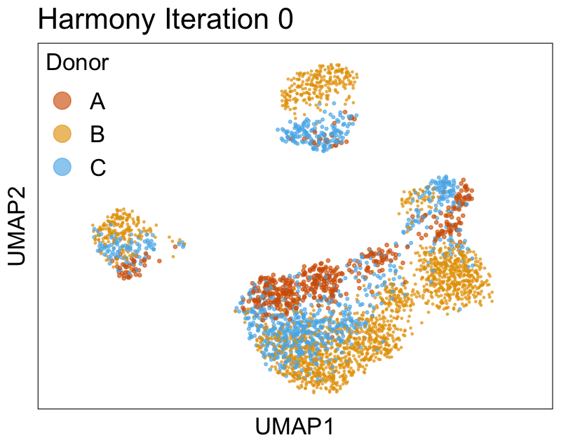
We can also look at PCs. For example, take a closer look at cells moving along PC1. You might notice that the cells on the right side of the panel move more than the cells on the left side of the panel. This tells us all cells do not get an identical adjustment along PC1. Instead, each cell’s PC1 value is adjusted differently than its neighbors.
By coloring points with gene expression values, we can focus on specific genes:
Use HTML and CSS to arrange the GIFs #
Finally, we can use HTML and CSS to arrange the GIF files next to each other on an HTML page.
<style>
.column {
  max-width: 17%;
}
.column2 {
  max-width: 60.5%;
}
</style>

<div>
  <div class="column2">
    <img src="donor.gif">
  </div>
  <div class="column">
    <img src="CD3D.gif">
    <img src="CD8A.gif">
    <img src="GZMK.gif">
  </div>
  <div class="column">
    <img src="MS4A1.gif">
    <img src="CD14.gif">
    <img src="FCGR3A.gif">
  </div>
</div>
See several examples of different arrangements at this link. (Right-click and view source to see the HTML and CSS.)
Once the GIF files are arranged nicely on the HTML page, we can use LICEcap to capture what appears on screen into a GIF file. That way, a single GIF file contains multiple views of the data. Lastly, we can edit the speed, quality, and other features of the captured GIF file after uploading it to ezgif.com.
Read the paper #
To learn more about Harmony, please check out the paper. It has many examples showing how to align multiple different data sets.
See the original data #
In this post, we used the data included in the MUDAN package. The original source of the data is 10x Genomics.
Get the original data published by 10x Genomics:
Reply by Email