Here, we use the 2D kernel density estimation function from the MASS R package to to color points by density in a plot created with ggplot2. This helps us to see where most of the data points lie in a busy plot with many overplotted points.
Load libraries, define a convenience function to call MASS::kde2d, and generate some data:
library(MASS)
#>
#> Attaching package: 'MASS'
#> The following object is masked from 'package:dplyr':
#>
#>     select
#> The following object is masked from 'package:patchwork':
#>
#>     area
library(ggplot2)
library(viridis)
#> Loading required package: viridisLite
#>
#> Attaching package: 'viridis'
#> The following object is masked from 'package:scales':
#>
#>     viridis_pal
theme_set(theme_bw(base_size = 16))

# Get density of points in 2 dimensions.
# @param x A numeric vector.
# @param y A numeric vector.
# @param n Create a square n by n grid to compute density.
# @return The density within each square.
get_density <- function(x, y, ...) {
  dens <- MASS::kde2d(x, y, ...)
  ix <- findInterval(x, dens$x)
  iy <- findInterval(y, dens$y)
  ii <- cbind(ix, iy)
  return(dens$z[ii])
}

set.seed(1)
dat <- data.frame(
  x = c(
    rnorm(1e4, mean = 0, sd = 0.1),
    rnorm(1e3, mean = 0, sd = 0.1)
  ),
  y = c(
    rnorm(1e4, mean = 0, sd = 0.1),
    rnorm(1e3, mean = 0.1, sd = 0.2)
  )
)
Overplotting #
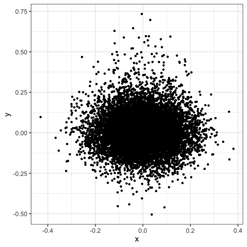
Notice how the points are overplotted, so you can’t see the peak density:
ggplot(dat) + geom_point(aes(x, y))

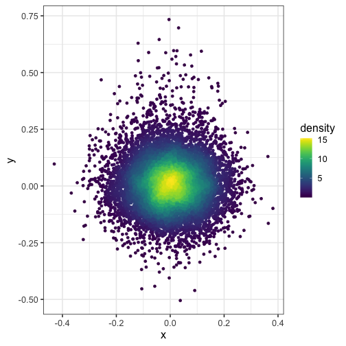
Here, we split the plot into a 100 by 100 grid of squares and then color the points by the estimated density in each square. I recommend viridis for the color scheme.
dat$density <- get_density(dat$x, dat$y, n = 100)
ggplot(dat) + geom_point(aes(x, y, color = density)) + scale_color_viridis()

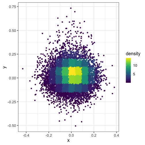
Here’s what happens when you set n = 15 (the squares in the grid are too big):
dat$density <- get_density(dat$x, dat$y, n = 15)
ggplot(dat) + geom_point(aes(x, y, color = density)) + scale_color_viridis()

Set the bandwidth of the kernel #
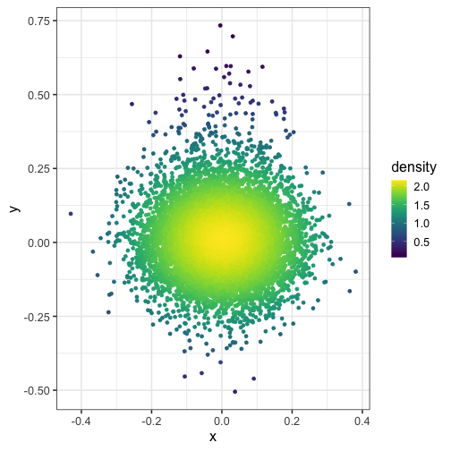
And what if you modify the bandwidth of the normal kernel with h = c(1, 1)?
dat$density <- get_density(dat$x, dat$y, h = c(1, 1), n = 100)
ggplot(dat) + geom_point(aes(x, y, color = density)) + scale_color_viridis()

Check out more packages #
Check out the MASS package for more cool functions!
Also consider using the ggpointdensity R package by Lukas Kremer. It was created two years after this note was published.
Reply by Email