Create a quantile-quantile plot with ggplot2
After performing many tests for statistical significance, the next step is to check if any results are more extreme than we would expect by random chance. One way to do this is by comparing the distribution of p-values from our tests to the uniform distribution with a quantile-quantile (QQ) plot. Here’s a function to create such a plot with ggplot2.
Simulate results from multiple tests#
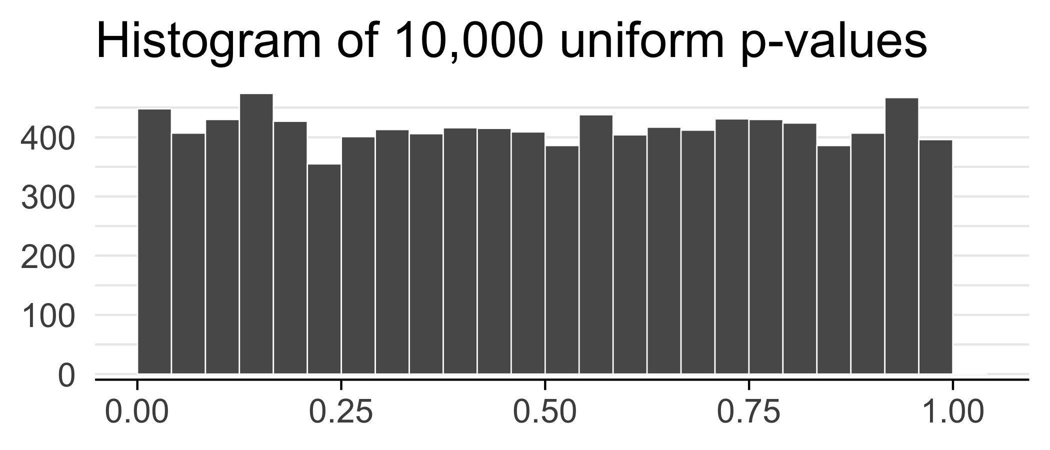
Suppose we did 10,000 tests and got a p-value for each test.
set.seed(42)
ps <- runif(n = 1e4)
ggplot(data.frame(ps)) +
  geom_histogram(aes(x = ps), bins = 25, color = "white", size = 0.3, boundary = 0.5) +
  theme_minimal(base_size = 20) +
  labs(x = NULL, y = NULL, title = "Histogram of 10,000 uniform p-values") +
  scale_y_continuous(expand = c(0.02, 0)) +
  theme(
    axis.line.x = element_line(size = 0.5),
    axis.ticks.x = element_line(size = 0.5),
    panel.grid.major.y = element_line(size = 0.5),
    panel.grid.minor.y = element_line(size = 0.5),
    panel.grid.major.x = element_blank(),
    panel.grid.minor.x = element_blank()
  )
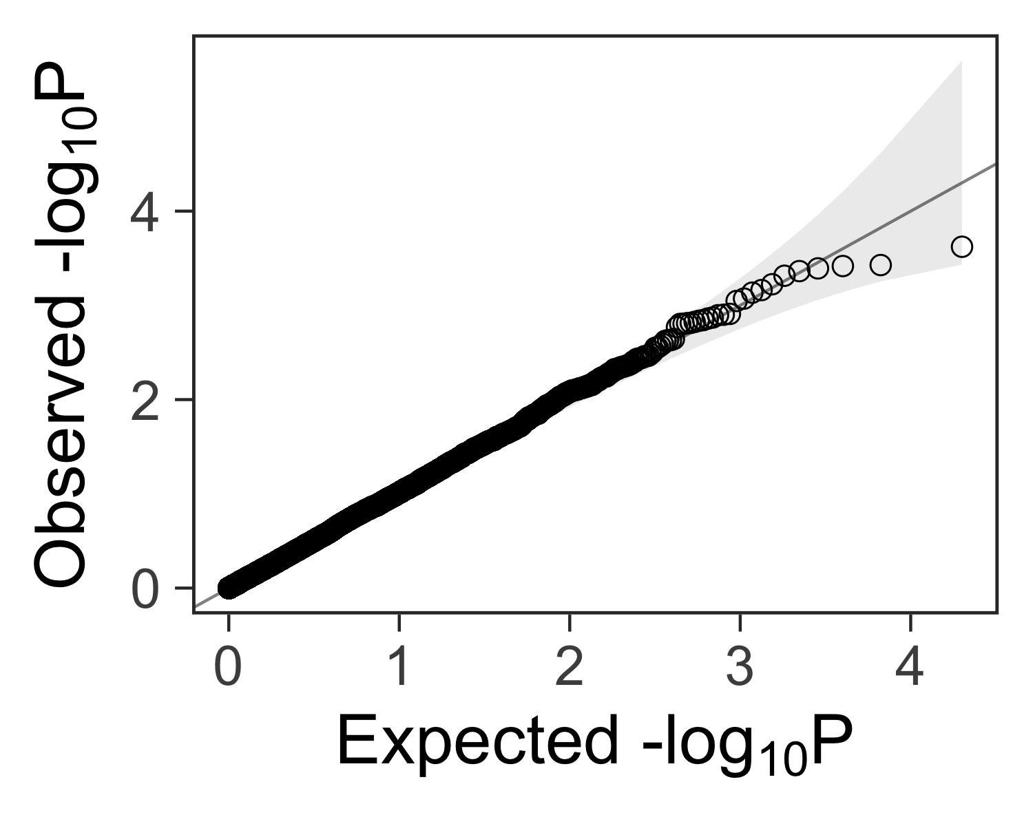
Define a function for making qqplots#
It would be nice to have a function that accepts a vector of p-values ps and
returns a ggplot2 plot that can be further customized.
We can use this function to create a quantile-quantile plot:
#' Create a quantile-quantile plot with ggplot2.
#'
#' Assumptions:
#'   - Expected P values are uniformly distributed.
#'   - Confidence intervals assume independence between tests.
#'     We expect deviations past the confidence intervals if the tests are
#'     not independent.
#'     For example, in a genome-wide association study, the genotype at any
#'     position is correlated to nearby positions. Tests of nearby genotypes
#'     will result in similar test statistics.
#'
#' @param ps Vector of p-values.
#' @param ci Size of the confidence interval, 95% by default.
#' @return A ggplot2 plot.
#' @examples
#' library(ggplot2)
#' gg_qqplot(runif(1e2)) + theme_grey(base_size = 24)
gg_qqplot <- function(ps, ci = 0.95) {
  n  <- length(ps)
  df <- data.frame(
    observed = -log10(sort(ps)),
    expected = -log10(ppoints(n)),
    clower   = -log10(qbeta(p = (1 - ci) / 2, shape1 = 1:n, shape2 = n:1)),
    cupper   = -log10(qbeta(p = (1 + ci) / 2, shape1 = 1:n, shape2 = n:1))
  )
  log10Pe <- expression(paste("Expected -log"[10], plain(P)))
  log10Po <- expression(paste("Observed -log"[10], plain(P)))
  ggplot(df) +
    geom_ribbon(
      mapping = aes(x = expected, ymin = clower, ymax = cupper),
      alpha = 0.1
    ) +
    geom_point(aes(expected, observed), shape = 1, size = 3) +
    geom_abline(intercept = 0, slope = 1, alpha = 0.5) +
    # geom_line(aes(expected, cupper), linetype = 2, size = 0.5) +
    # geom_line(aes(expected, clower), linetype = 2, size = 0.5) +
    xlab(log10Pe) +
    ylab(log10Po)
}
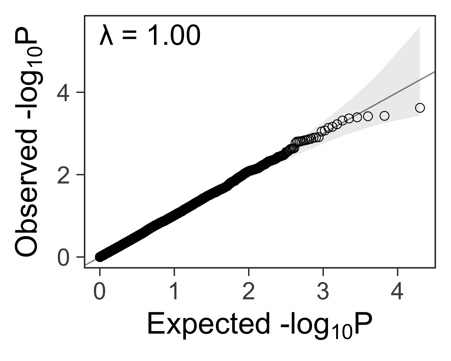
Create the plot#
We can add customizations to the object returned by gg_qqplot(ps) with
theme_bw(), theme(), and other functions.
gg_qqplot(ps) +
  theme_bw(base_size = 24) +
  theme(
    axis.ticks = element_line(size = 0.5),
    panel.grid = element_blank()
    # panel.grid = element_line(size = 0.5, color = "grey80")
  )
Lambda: a measure of inflated p-values#
In genome-wide association studies, we often see a lambda statistic \( \lambda \) reported with the QQ plot. In general, the lambda statistic should be close to 1 if the points fall within the expected range, or greater than one if the observed p-values are more significant than expected.
You can find more details here:
Here’s how you can compute it:
inflation <- function(ps) {
  chisq <- qchisq(1 - ps, 1)
  lambda <- median(chisq) / qchisq(0.5, 1)
  lambda
}
set.seed(1234)
pvalue <- runif(1000, min=0, max=1)
inflation(pvalue)
## [1] 0.9532617
gg_qqplot(ps) +
  theme_bw(base_size = 24) +
  annotate(
    geom = "text",
    x = -Inf,
    y = Inf,
    hjust = -0.15,
    vjust = 1 + 0.15 * 3,
    label = sprintf("λ = %.2f", inflation(ps)),
    size = 8
  ) +
  theme(
    axis.ticks = element_line(size = 0.5),
    panel.grid = element_blank()
    # panel.grid = element_line(size = 0.5, color = "grey80")
  )
Try using qqplotr#
In 2018, Alexandre Almeida created the qqplotr R package, and it looks great! Try it out.